2mins read
In this guide we use Japanese Candlestick charts — the most popular chart type used by traders worldwide. Every example below has a visual so you can see exactly what we mean. No prior experience needed.
1. What Is a Candlestick?
A single candlestick represents price movement during a specific time period — it could be 1 minute, 1 hour, or 1 day depending on your chart setting. Each candle contains four key pieces of information: the Open, High, Low, and Close price (often abbreviated as OHLC).
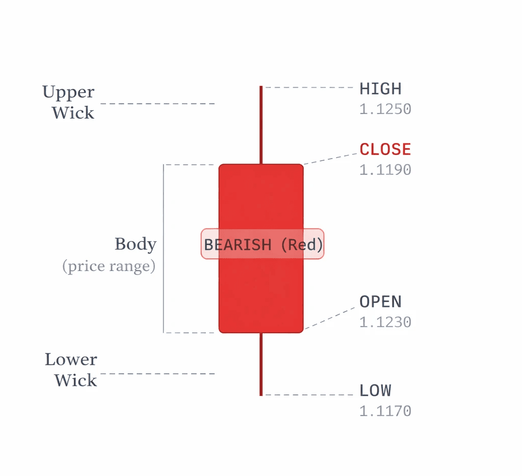
Fig 1 — Anatomy of a Japanese Candlestick (Bullish / Green)
💡 Quick Memory TrickThink of a candle like a thermometer inside a tube. The tube (body) shows where price opened and closed. The thin lines above and below (wicks) show how far price traveled in each direction before coming back.
2. Green vs Red Candles
The color of a candlestick immediately tells you whether price went up or down during that period:
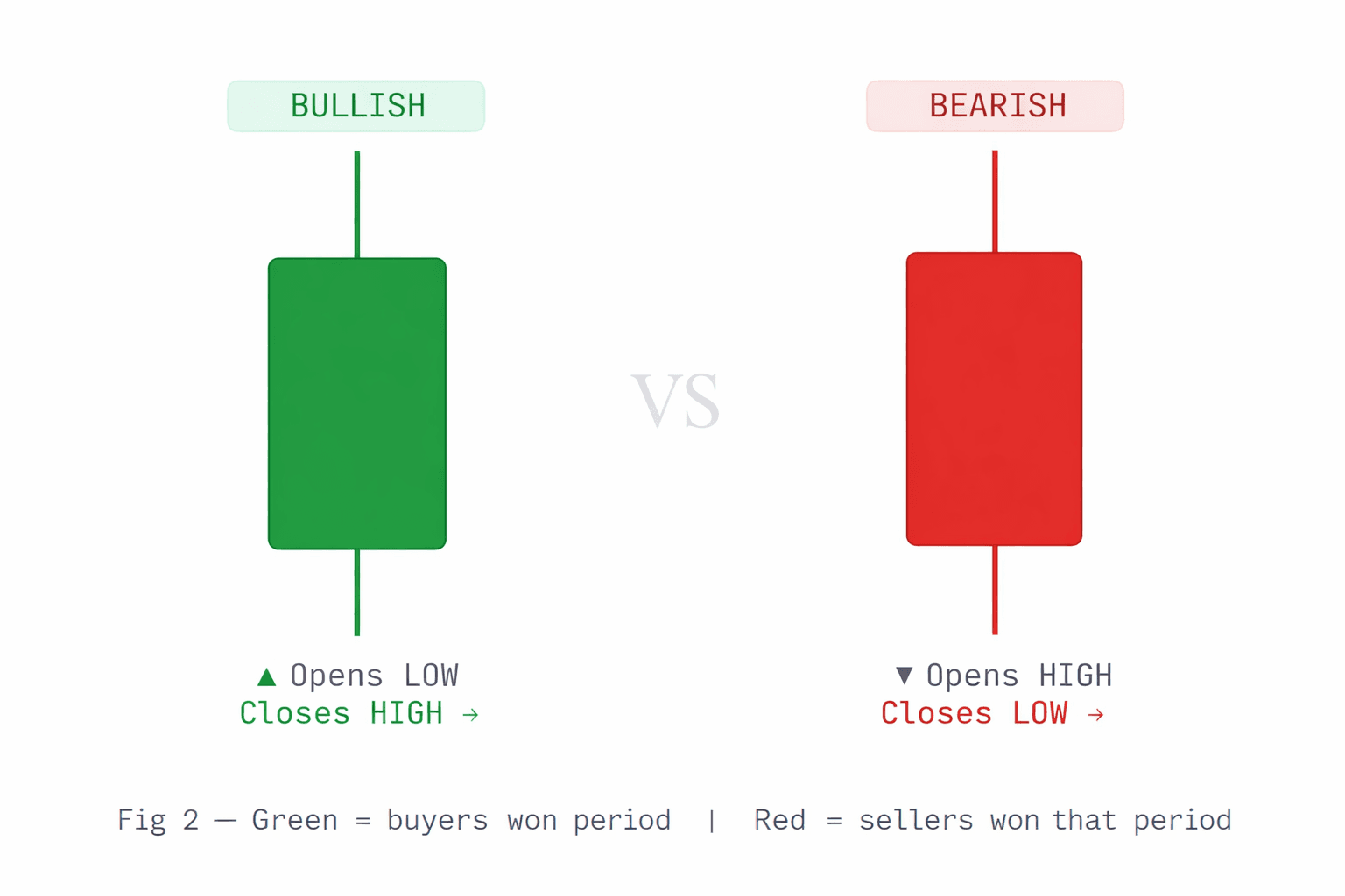
Example: On the EUR/USD pair, if you see a large green candle on the 1-hour chart, it means the euro strengthened against the dollar during that hour — buyers pushed the price up from open to close.
3. Reading a Real Chart
A forex chart is just many candlesticks placed side by side in order of time (left = older, right = newer). Let's look at a sample EUR/USD chart with multiple candles:
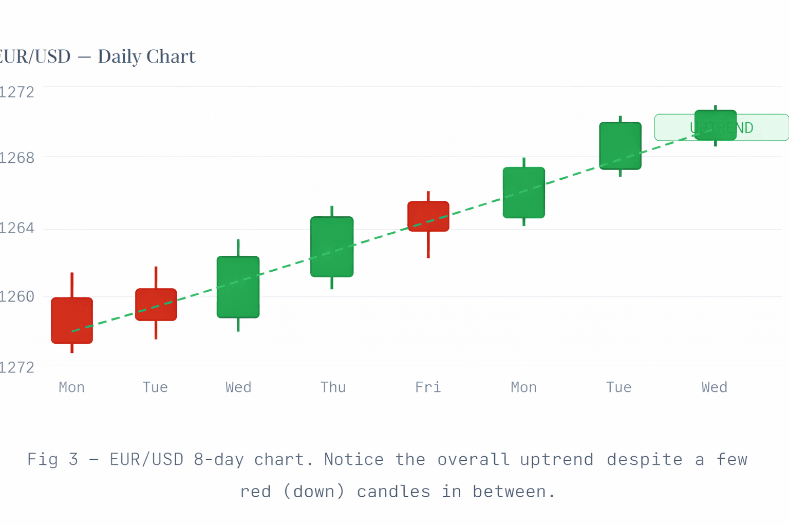
Notice how even in an uptrend, there are occasional red candles — that's completely normal. Trends are never perfectly straight lines. The key is that the overall direction is moving up (higher highs and higher lows).
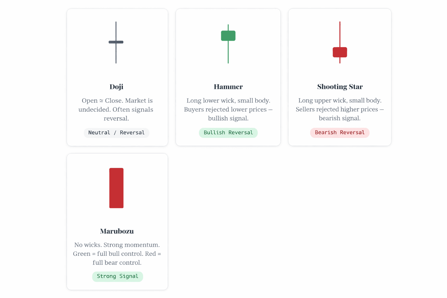
4. Key Candlestick Patterns
Certain candlestick shapes appear repeatedly and signal potential changes in market direction. Here are the most important ones every beginner should know:
5. Bullish Engulfing Pattern
This is one of the most powerful reversal signals. It happens when a large green candle completely "swallows" the previous red candle. It means buyers have taken full control from sellers.
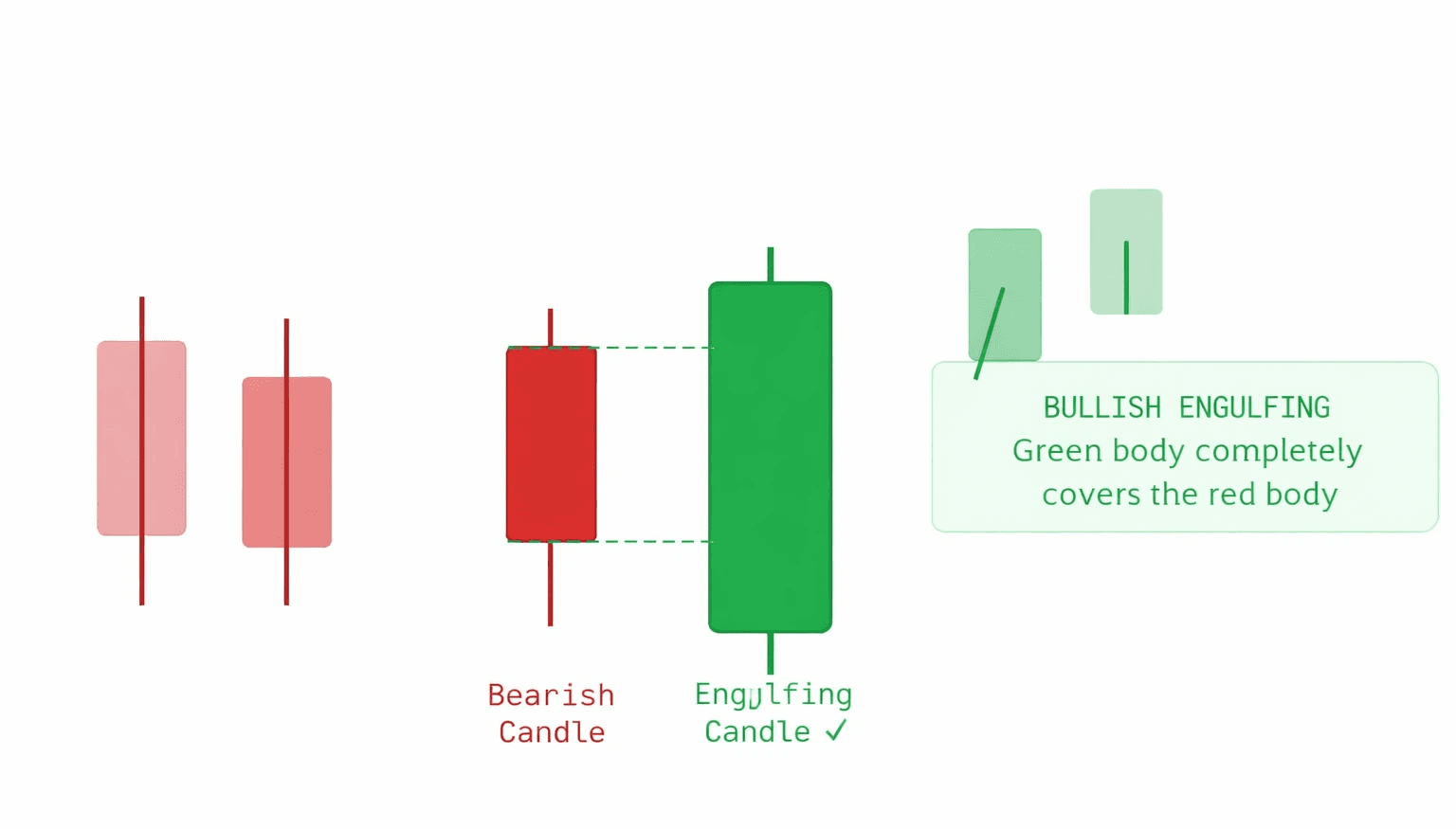
Fig 5 — Bearish Engulfing: the red candle engulfs the green. Watch out for potential downward move.
7. Support & Resistance
These are price levels where the market has bounced multiple times in the past. Think of them as a floor (support) and a ceiling (resistance):
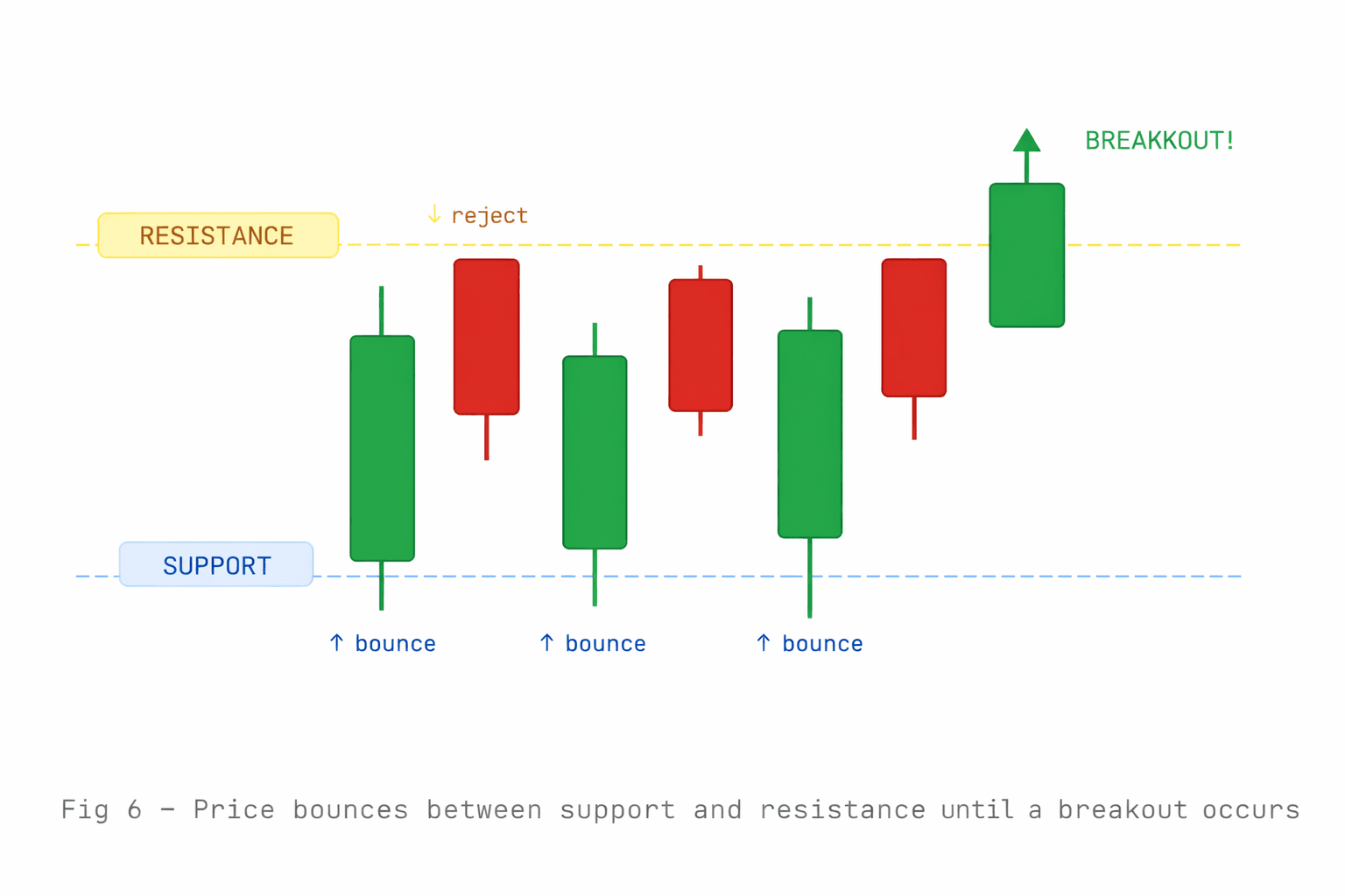
💡 Real-world exampleImagine GBP/USD keeps bouncing at 1.2500. Every time price drops to 1.2500, buyers step in and push price back up. That level is support. If a big red candle breaks below 1.2500, support has been broken — that's a sell signal.
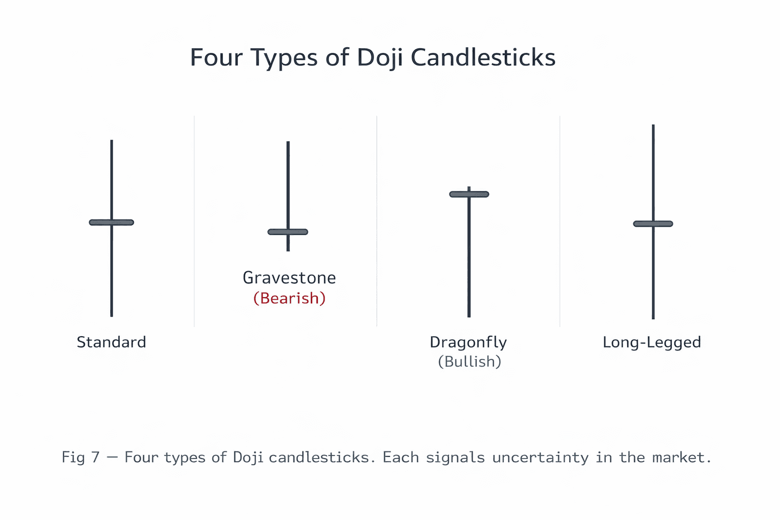
8. The Doji - Market Indecision
A Doji forms when the open and close prices are almost identical - resulting in a candle with a tiny (or no) body. It means neither buyers nor sellers could take control during that period. Dojis often appear before significant moves.
9. Three White Soldiers & Three Black Crows
These are multi-candle patterns that signal the start of a strong new trend:
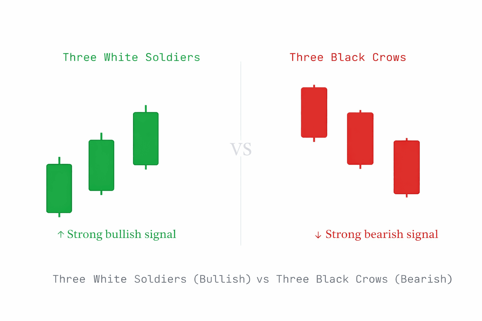
⚠️ CautionNo pattern is 100% accurate. Always use candlestick patterns together with other analysis — like support/resistance levels and trend direction — before making any trading decision. Never risk money you cannot afford to lose.
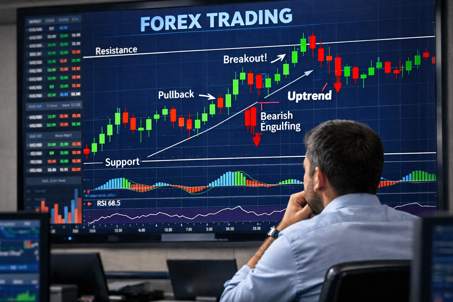
10. Putting It All Together
Here's a real-world reading exercise. Look at this chart and try to identify what you've learned:
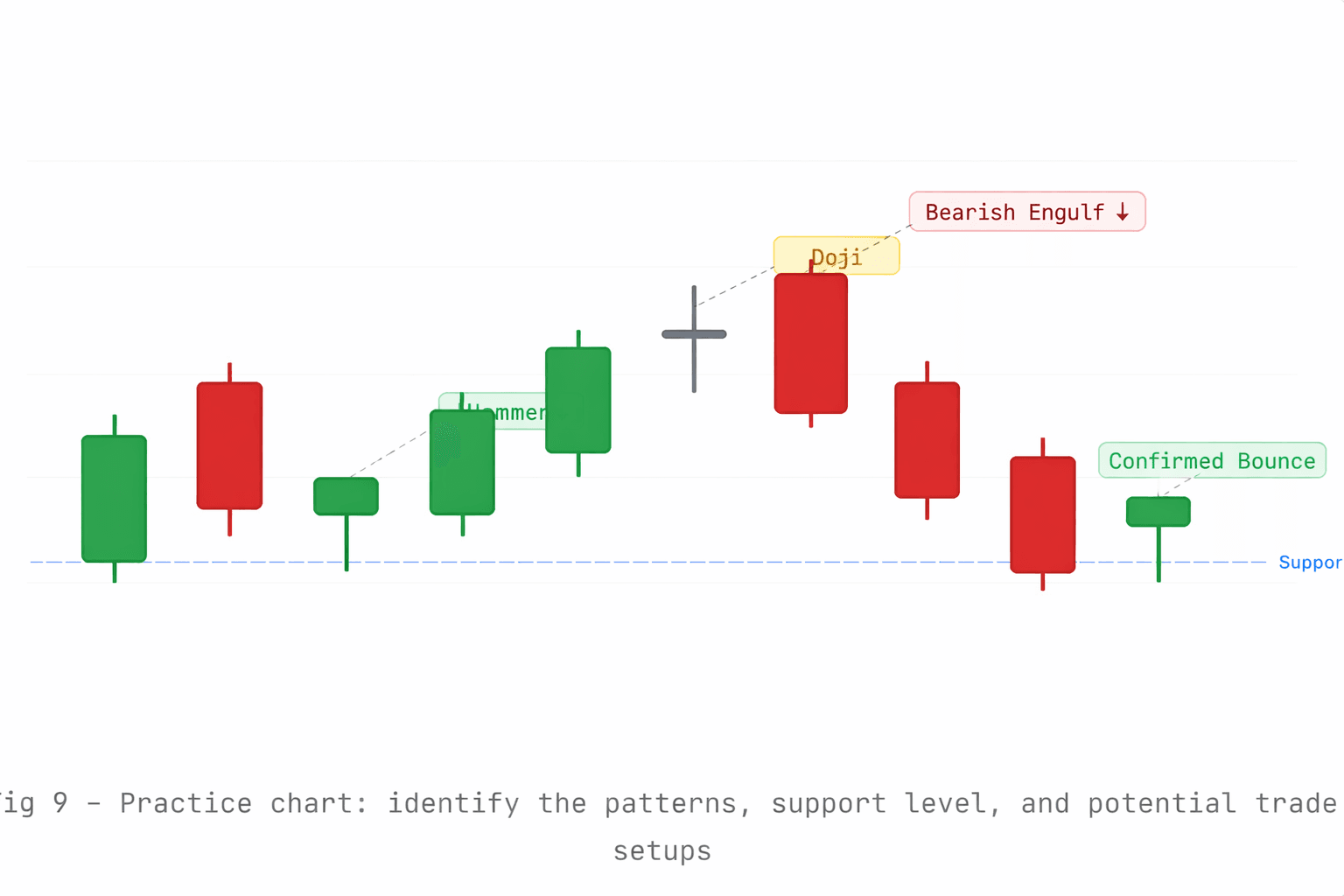
Can you spot the hammer at support, the doji warning, the bearish engulfing, and the second bounce at support? If yes — you're already thinking like a forex chart reader.
🎯 Your Next Steps Open a free demo account on any forex platform (like Olympus Capital). Switch the chart to "Candlestick" view. Start identifying what you've learned here on real historical charts - EUR/USD or GBP/USD are great starting pairs. Practice reading patterns for 30 days before risking any real money.


